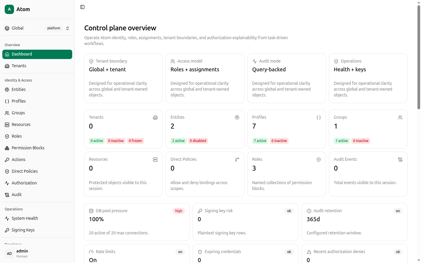
Dashboard
The Atom Next control plane overview — summary tiles, entity mix, and relationship traces.
The Dashboard is the landing page after login (/dashboard). It has no create or edit
actions of its own — it's a read-only summary that links into the rest of the UI.
Layout
The page is built from four rows of cards:
- Model summary — four static cards describing how this Atom instance is configured:
Tenant boundary (
Global + tenant), Access model (Roles + assignments), Audit mode (Query-backed), and Operations (Health + keys). - Counts — live counts for Tenants, Entities, Profiles, Groups, Resources, Direct Policies, Roles, and Audit Events, each broken down by status (for example Entities shows active vs disabled). Every count tile is a link — clicking Tenants navigates to Tenants, clicking Roles navigates to Roles, and so on.
- Operational gauges — DB pool pressure, Signing key risk, Audit retention,
Rate limits, Expiring credentials, and Recent authorization denies, each with a
status pill (
ok,on, or a severity likehigh). These mirror figures also shown in more detail on Operations. - Analysis widgets — Entity Mix (a donut of principals by kind: Humans, Devices, Services, Workloads, Applications), Resource Kinds (top resource kinds from the first 200 visible resources), Attention Needed (orphan policies, expiring credentials, authorization denies), Authorization Posture (allow/deny policy and decision counts), and a Relationship trace diagram illustrating how Principal Groups, Roles, and Object Groups connect for a sample scenario.
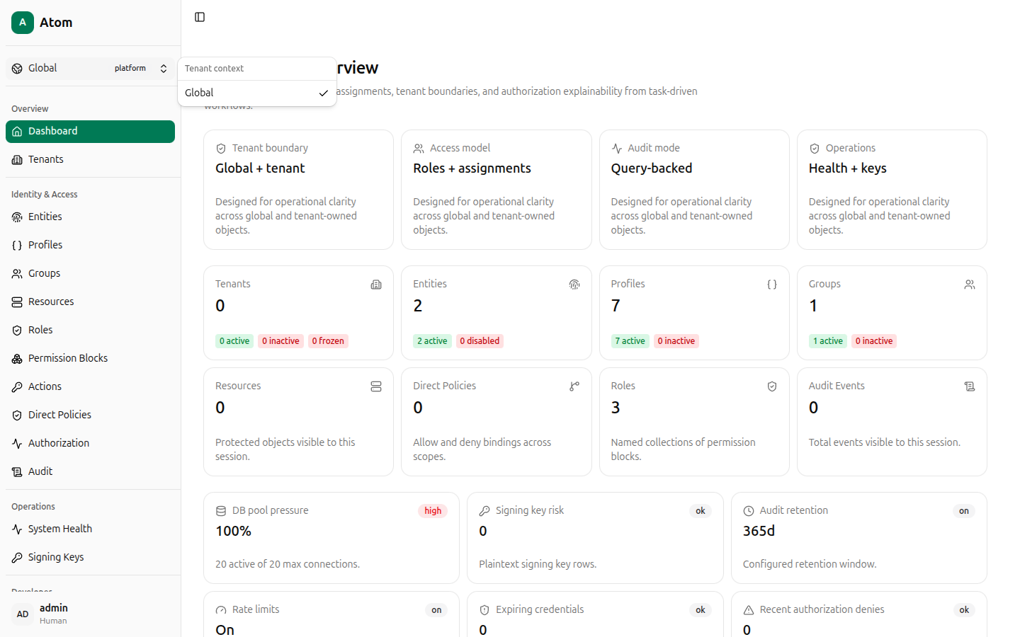
Tenant context switcher
The Global / platform control at the top of the sidebar (above Overview) opens a Tenant context menu listing Global plus every tenant you have created. Selecting a tenant scopes list views and create-dialog defaults toward that tenant, but does not hide platform-scoped records — most list pages still expose their own Tenant filter column independently of this switcher.
Sidebar structure
The left sidebar is grouped into five sections, each linked from this guide:
- Overview — Dashboard, Tenants
- Identity & Access — Entities, Profiles, Groups, Resources, Roles, Permission Blocks, Actions, Direct Policies, Authorization
- Audit — Audit
- Operations — System Health, Signing Keys
- Developer — Endpoints, Playground
The Toggle Sidebar button (top-left, above the logo) collapses the sidebar to icons only, useful on narrow screens or when you want more room for wide tables.
Your own account — name, kind (Human), and a menu for Profile settings, Theme, and
Log out — sits at the bottom of the sidebar. See Account.